Beamish
Metal Works
The products deserve a storefront that looks as crafted as they are.
Good business.
Underperforming storefront.
What is real
- Distinctive, made-to-order products
- Strong craftsmanship story
- 4.9 stars / 1,408 reviews
- Secure Shopify checkout
- Large, diverse catalog
What holds it back
- The homepage opens as a product configurator—not a brand story
- Sections are effectively invisible due to white-on-white text
- Popups and floating widgets interrupt before trust is earned
- Slow mobile experience: 46 performance
- The catalog feels accumulated, not curated
The technical baseline
Median of three Lighthouse mobile runs, captured 1 Aug 2026. Individual performance scores were 43, 46, and 46.
The homepage skips the most important question
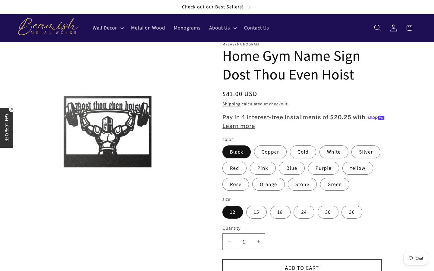
“Why Beamish?” is missing
- No concise value proposition above the fold
- No workshop, maker, sparks, steel, wood, or finished-room lifestyle hero
- A single novelty gym sign becomes the entire opening statement
- Customization choices arrive before context or desire
- Large empty image canvas makes the product feel small and unfinished
Much of the homepage is white text on white
Measured contrast on collection names, review details, the “Yes. We are on Etsy!” section, newsletter headings, and footer content.
WCAG expects 4.5:1 for normal text.
- Desktop and mobile captures show giant blank regions
- Users can scroll past products, the mission, Etsy proof, and footer without seeing them
- This is not subtle polish—it is missing content
- Likely a Shopify color-scheme/theme setting conflict
Lighthouse identified 10 contrast failures; Axe reproduced serious contrast violations on desktop and mobile.
Usable, but crowded before the sale
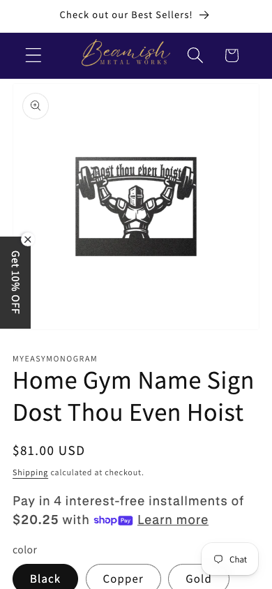
- The product image is visible, but surrounded by excessive empty space
- The title wraps to four lines before price or CTA
- “Get 10% OFF” and Chat float over the shopping flow
- The add-to-cart action is far below the first screen
- Fourteen color pills + six size pills create decision fatigue
Ask for the email after earning interest
Immediate modal
“Get 10% OFF” blocks the page before a visitor has seen the products or knows the brand.
Persistent coupon tab
The closed promotion remains stuck to the left edge, competing with navigation and content.
Chat bubble
Useful in principle, but another floating control adds visual noise and overlaps mobile options.
575 products need a point of view
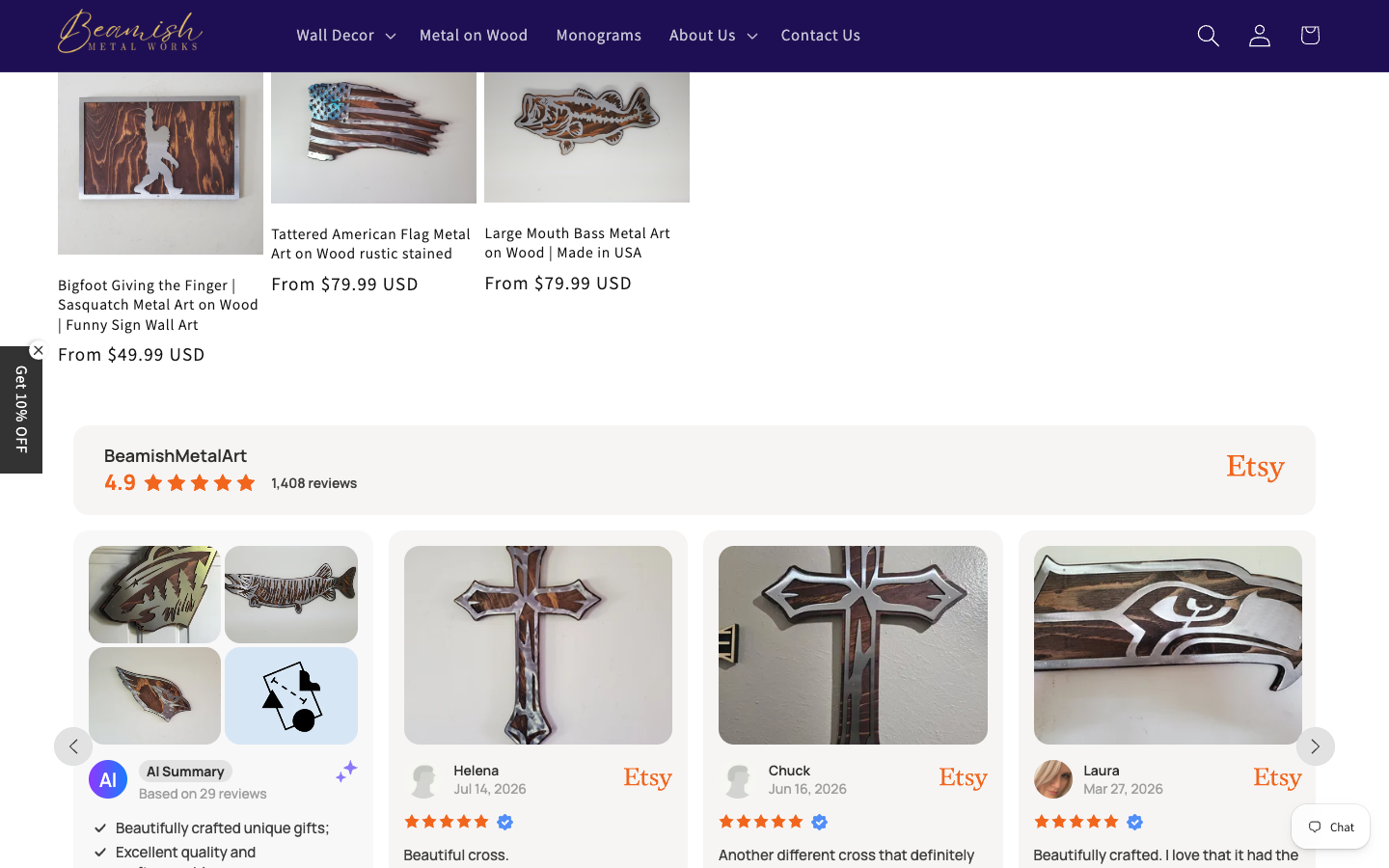
- 30 collections and overlapping labels make discovery harder
- Product titles are long, keyword-heavy, and visually inconsistent
- Photography mixes clean cutouts, workshop shots, lifestyle scenes, and different crops
- Some alt text is numeric IDs—not useful descriptions
- The strongest trust asset—1,408 Etsy reviews—appears too late
The About page has the hero story the homepage needs
“I designed and built a CNC plasma metal cutting machine.”
That is memorable
- Started as a welding and fabrication shop in 2017
- Built unique nut-and-bolt sculptures
- Designed and built custom CNC equipment
- Family shop in Isle, Minnesota
- Made and shipped in the USA
Put this near the top
Use a real workshop portrait or short process video beside a sharp statement:
“American-made metal art, cut and finished to order in our family shop in Isle, Minnesota.”
89 is decent. The failures are still real.
Quantity input has no associated label.
White-on-white contrast failures hide content.
Etsy review link has no discernible accessible name.
Popup content falls outside a page landmark.
Eight images repeat nearby text in their alt descriptions.
Several product images use numeric IDs as alt text.
Automated tools do not replace keyboard and screen-reader testing, but these findings are directly reproducible.
The apps are heavier than the artwork
- 385 KB estimated unused JavaScript
- 422 KB estimated image savings
- 6.1 seconds main-thread work
- Prioritize the hero image with
fetchpriority="high" - Remove duplicate/unneeded analytics destinations
- Delay popup and review widgets
- Correct Shopify responsive image sizes
Technically strong. Editorially dated.
Working
- Lighthouse SEO: 100
- Canonical URL present
- Robots.txt and XML sitemaps present
- Open Graph + Twitter metadata
- Three JSON-LD blocks
- Real 404 status on unknown routes
Improve
- Homepage title reads like a keyword phrase, not a polished brand
- Meta description is roughly 260 characters and likely truncates
- Product URLs/titles are aggressively keyword-stuffed
- Only three indexed content pages beyond products/collections
- Some social image markup uses an
http://URL
No emergency. A few hardening gaps.
/favicon.ico returns 404This was passive inspection, not penetration testing. Shopify manages most platform-level security.
A better first 20 seconds
Real room/workshop image, one-sentence promise, Shop Best Sellers + Create Custom Sign.
4.9 stars, 1,408 reviews, Made in USA, family-owned, made to order.
Gifts, personalized, outdoors, faith, sports, metal on wood.
Design → cut → finish → ship, using real shop photography.
Six consistent cards with clear starting price and customization cue.
Meet the maker, then invite custom work and email signup.
Fix the leaks before repainting the house
This week
- Fix white-on-white theme colors
- Repair favicon 404
- Label quantity input and review link
- Delay email popup/chat
- Move review proof above the fold
Next 30 days
- Build a true homepage hero
- Standardize product photography
- Simplify collections/navigation
- Rewrite titles and metadata
- Trim third-party scripts
60–90 days
- Launch sizing/customization guides
- Create customer-room stories
- Publish gift/occasion SEO content
- A/B test hero and discount timing
- Measure conversion by device
Keep the substance. Upgrade the presentation.
The site does not need to become slick and generic. It needs to become intentional, visual, and trustworthy enough to match the work.
People already love the products.
Make the website prove why before asking them to buy.
Prepared independently for constructive discussion. Findings reflect the live site observed 1 Aug 2026.
What was tested
- Desktop and 390px mobile render
- Homepage, About, Contact, Collab, invalid route
- Lighthouse mobile audit
- Axe automated accessibility scan
- Headers, TLS, DNS, robots, sitemap
- Metadata and structured data inventory
- Passive, non-destructive testing only
- No Shopify admin or analytics access
- No checkout purchase completed
- No manual screen-reader session
- No legal/privacy compliance opinion
- Scores are a point-in-time sample